Objective
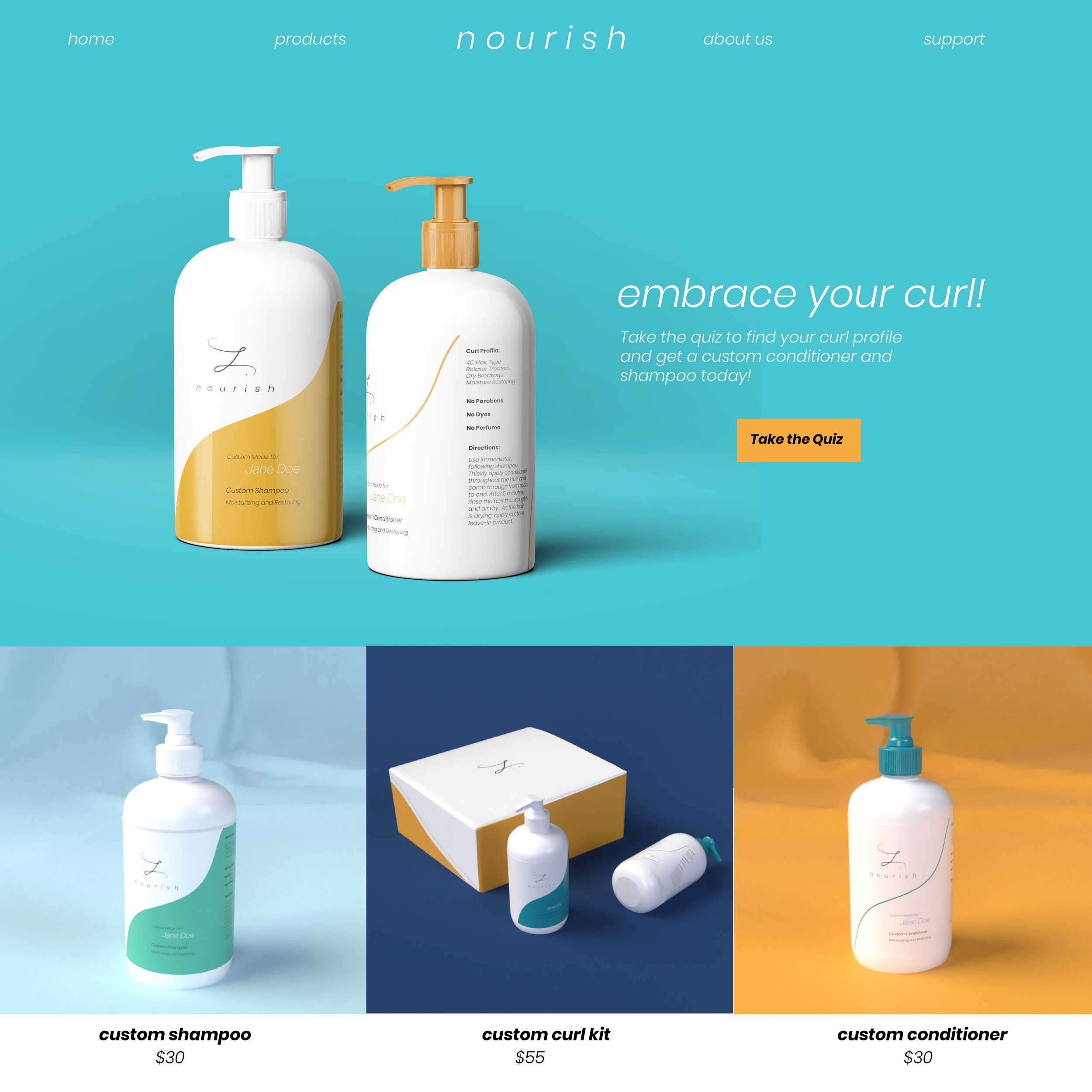
Students were tasks with creating conceptual designs for an Online Niche retailer of our choice. I chose to create an ethnic hair care brand that could be ordered online and customized to the consumer’s hair color. From logo to 3D renders of mock ups to the photographs, I brought the brand to fruition.
Target Audience
Through ethnographic research and persona development, the target audience would be people of color between the ages of 18-45 either pursuing their natural hair care journey or taking care of someone who is. The pivotal point for the color choices was the inclusion of parents within the target audience taking care of their children’s hair.
Collateral
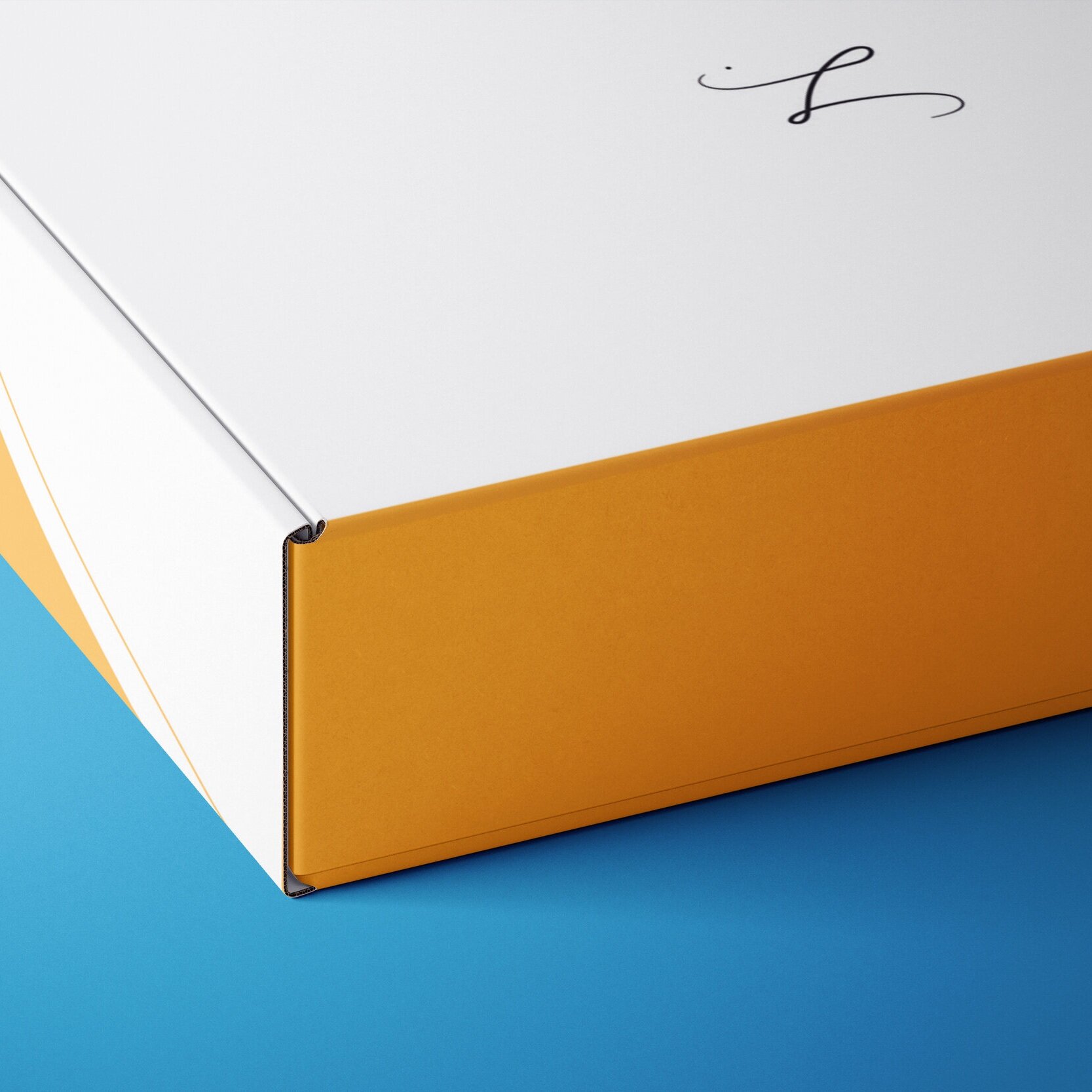
I created a logo design, bottle designs, a box design, mailer, email marketing, website homepage, and social media marketing for the brand.
Tools Used
Adobe Illustrator, Adobe InDesign, Studio Photography, Adobe Dimension, Adobe Capture and Adobe Photoshop

Logo Process
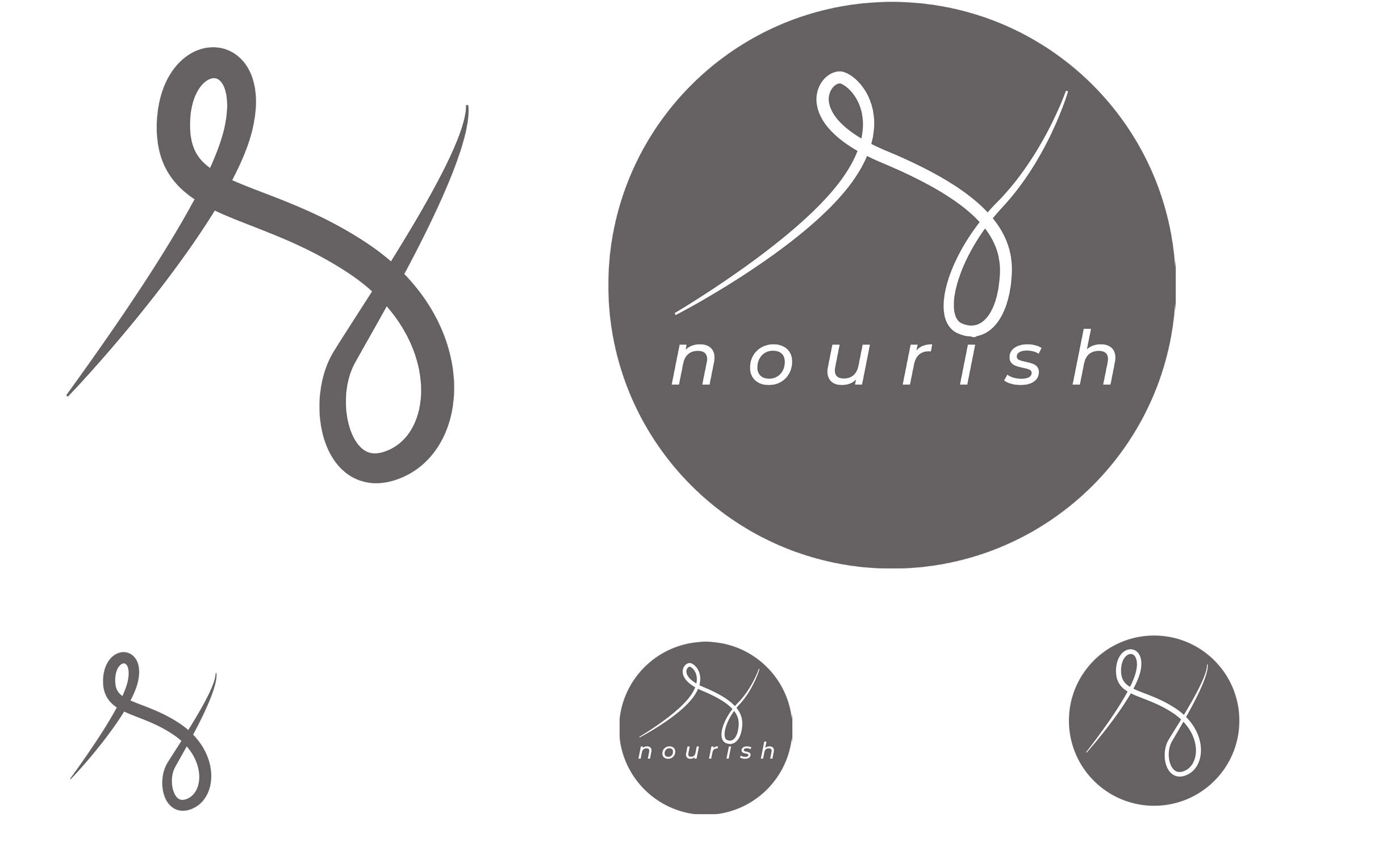
Logo Iteration 1

Logo Iteration 2

Logo Iteration 3
Logo Iteration 1
After completing 50 very different hand drawn sketches for the logo of this ethnic hair care brand, I settled on the design that featured an N but portrayed it in the similar nature of a strand of hair. I created a few versions of that as I began to move forward.
Logo Iteration 2
I played around with stretching the strand out as well as doing a more type dominant logo. The idea I am focusing on in this stage is using one of the curls to dot the eye, or using the whole mark itself to dot the eye.
Logo Iteration 3
With some difficulty in the portrayal of the strand, I went back to doing some research on my design as well as on the word nourish. Through some self ethnography of my families culture, I discovered the education system at a time included shorthand as part of the curriculum within predominantly black schools. In my third revision, the mark featured is the shorthand for “nourishment.” It still features a similar look to the original design I was working with while having cultural significance.
Final Logo
The final logo once digitized, featured some varying line weight changes to still mimic the idea of a hair strand. As I got feedback from others, there became a divide in opinions as to the concern of whether it was too thin while others felt the delicate nature of the logo was representative of the brand and how ethnic hair has to be treated with care. As a result, the final decision of keeping it thin was made as I went into designing the full brand and the deliverables.

Final Logo Design
Additional Deliverables

Website Homepage (View full scrolling page below)

Email Marketing on Mobile Device

Social Media Marketing on Mobile Device

Instagram Ad 2

Instagram Ad 3